

01 / Approval journey
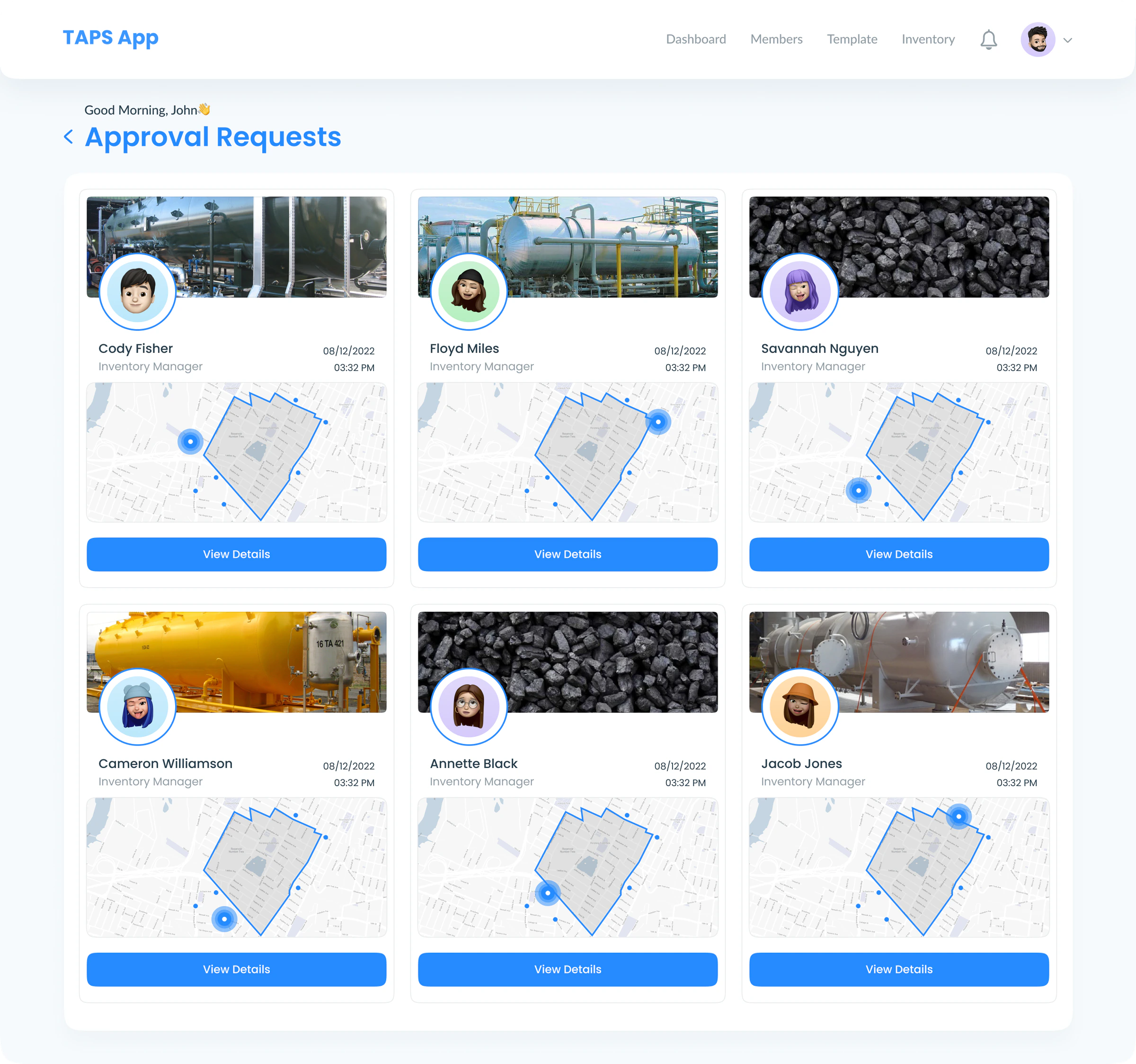
Review the queue.
Scan the requester, product, location, and time before opening a request.

TAPS — UI / UX DESIGN
Connecting people, inventory, and places
in one focused workspace.
The business reasoning
An item record alone cannot answer who is responsible for it, where it belongs, or why a location request needs approval. The design challenge was to connect those questions across company, template, and inventory roles.
Inventory decisions depend on reliable context. When responsibility or location is unclear, teams risk extra coordination and inconsistent approvals. Administrators also need consistent records as the inventory grows.
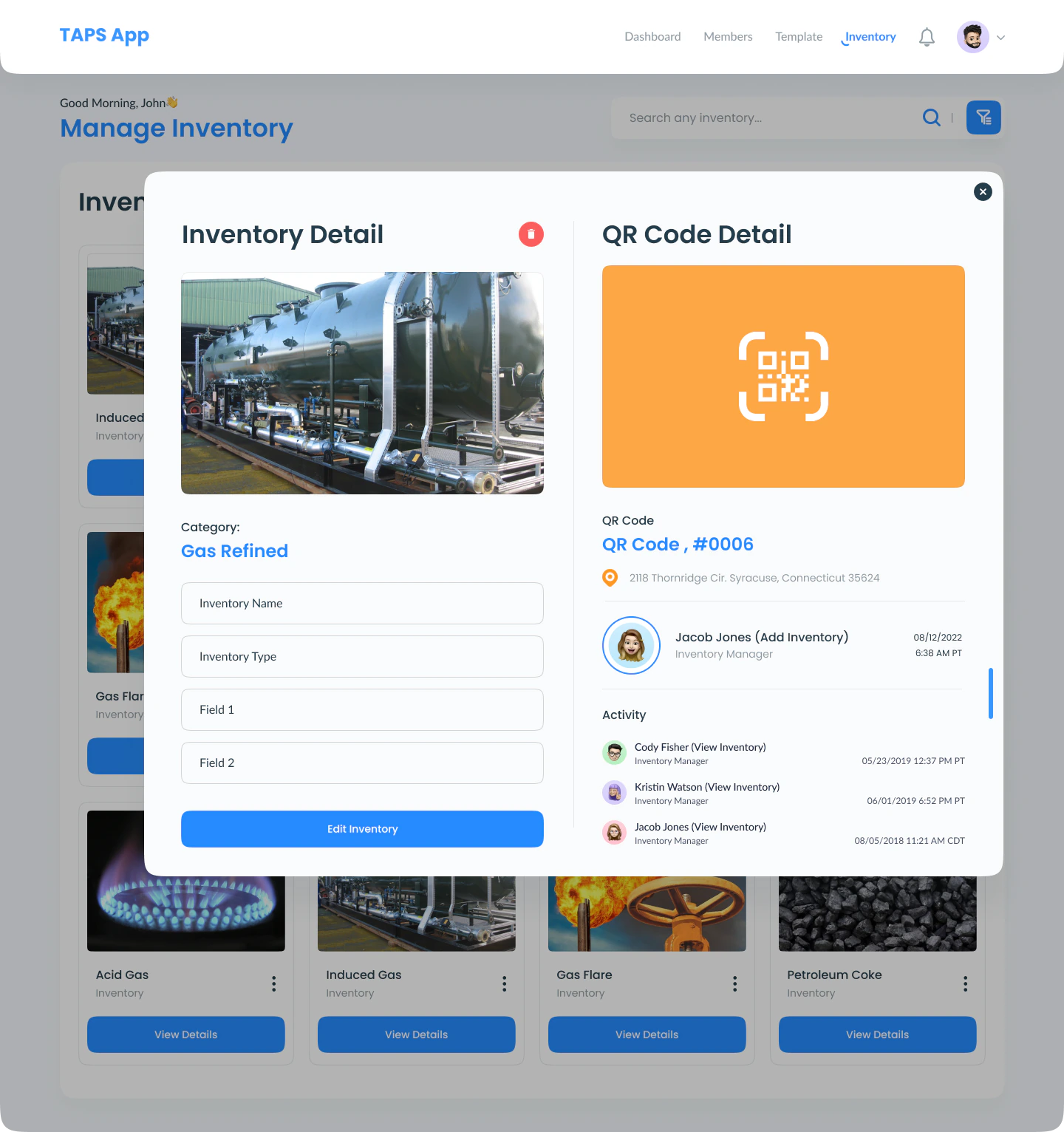
I brought the owner, custom fields, activity, QR code, and location into the item detail view. Reusable templates structure the records, while role-specific journeys separate administration from daily inventory work. Approval review connects the request with its product and location comparison.
The resulting design gives reviewers a connected evidence trail from request to item to map. QR scanning provides a direct entry to a record, and templates provide a repeatable way to capture information. These are concrete design outcomes that support clearer decisions; faster lookup and approval remain goals to validate.
01 / The challenge
TAPS connects an item to its location, the people responsible for it, and its activity. The design brings company oversight, template setup, and daily inventory work into one system, with a focused path for each role.
02 / The overview
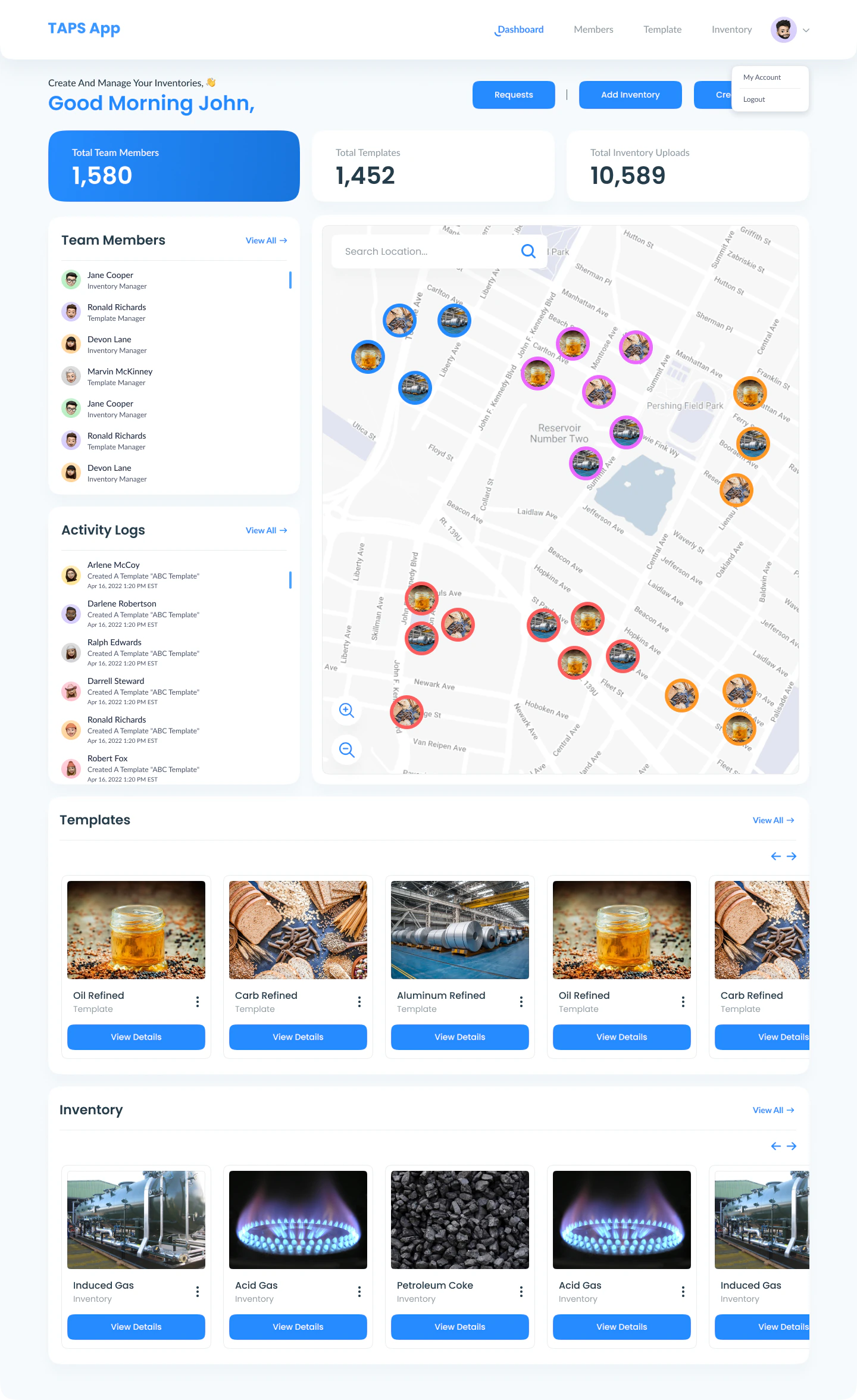
Summary cards establish scale. Activity shows what changed. The map gives every record a physical context.
03 / People & structure
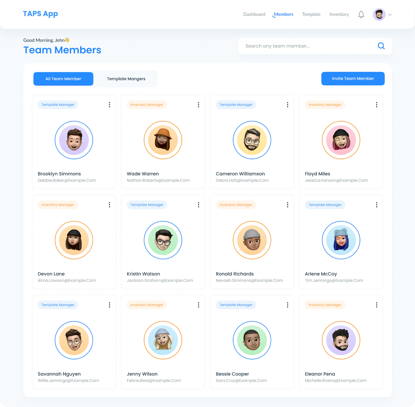
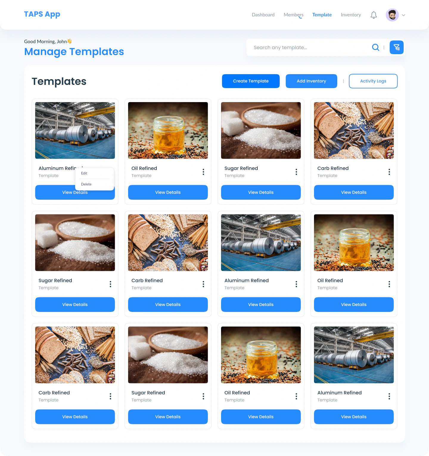
Company admins need the whole picture. Template managers define how information is captured. Inventory managers need a direct route to the item. Shared components keep those experiences familiar.
Role labels and member details connect the person to the work.
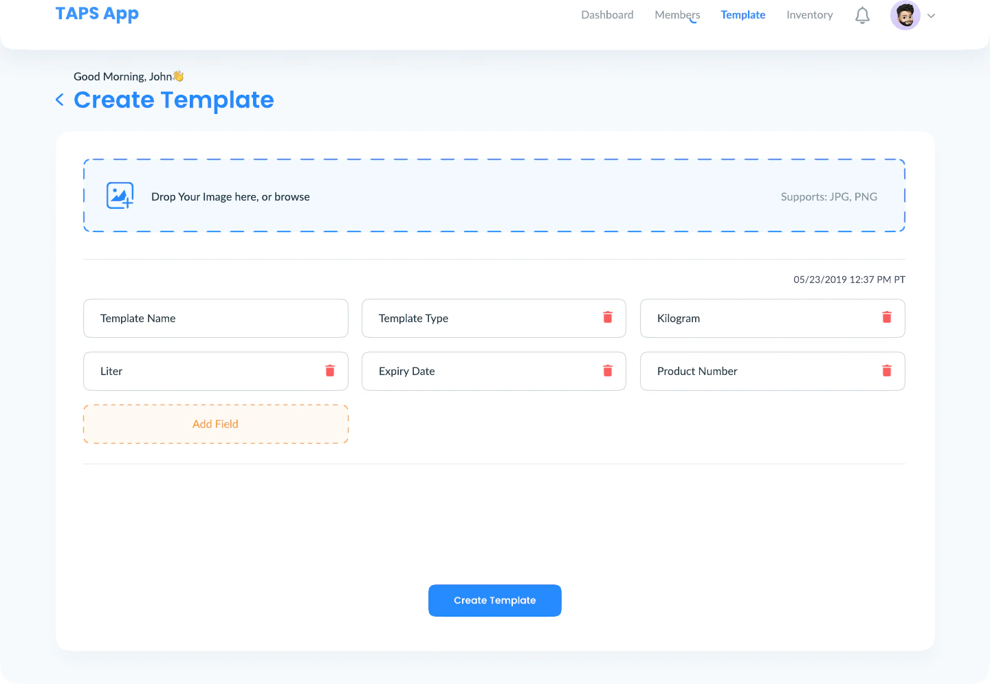
Reusable templates make different records part of the same system.
Explore the three journeys
The overview
The company experience brings members, activity, locations, templates, and inventory into a shared dashboard. Invitations and role assignment establish who can do what.
04 / Create with context
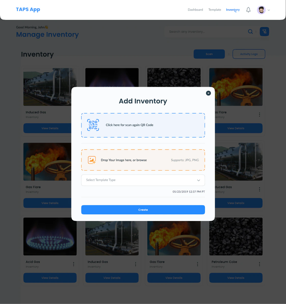
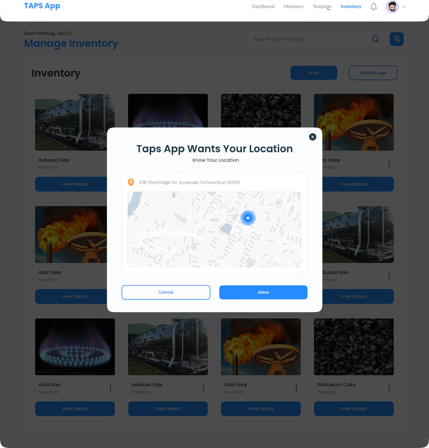
Choose fields, add an item, and establish its location. Each step keeps the surrounding workspace in view.
05 / The daily work
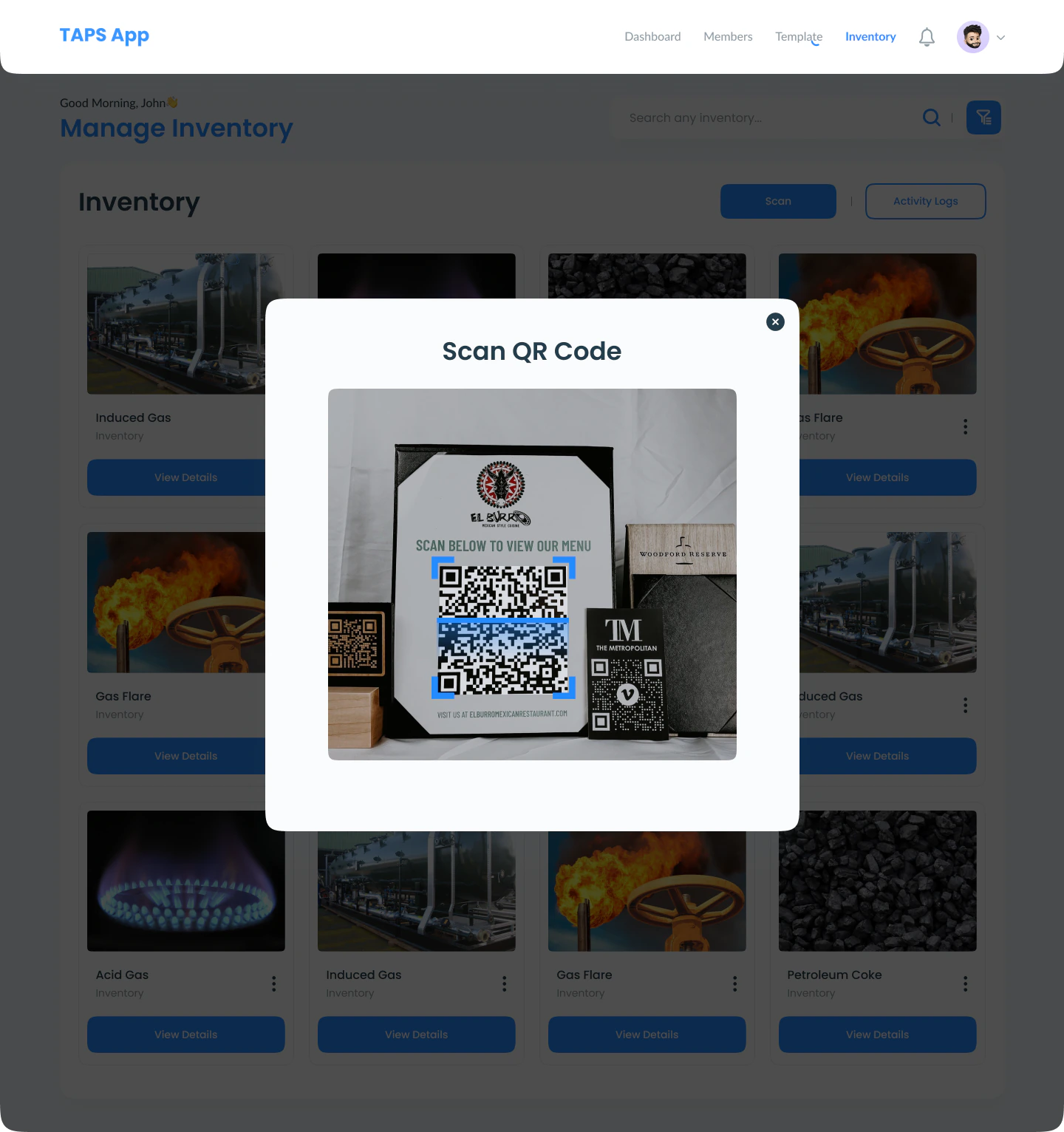
A QR code provides a direct route to an inventory record. The detail view brings together the product, custom fields, owner, activity, and location, so the next decision starts with useful context.
A shorter path
The scanning state makes the next action clear while preserving the inventory behind it.
06 / Approval workflow
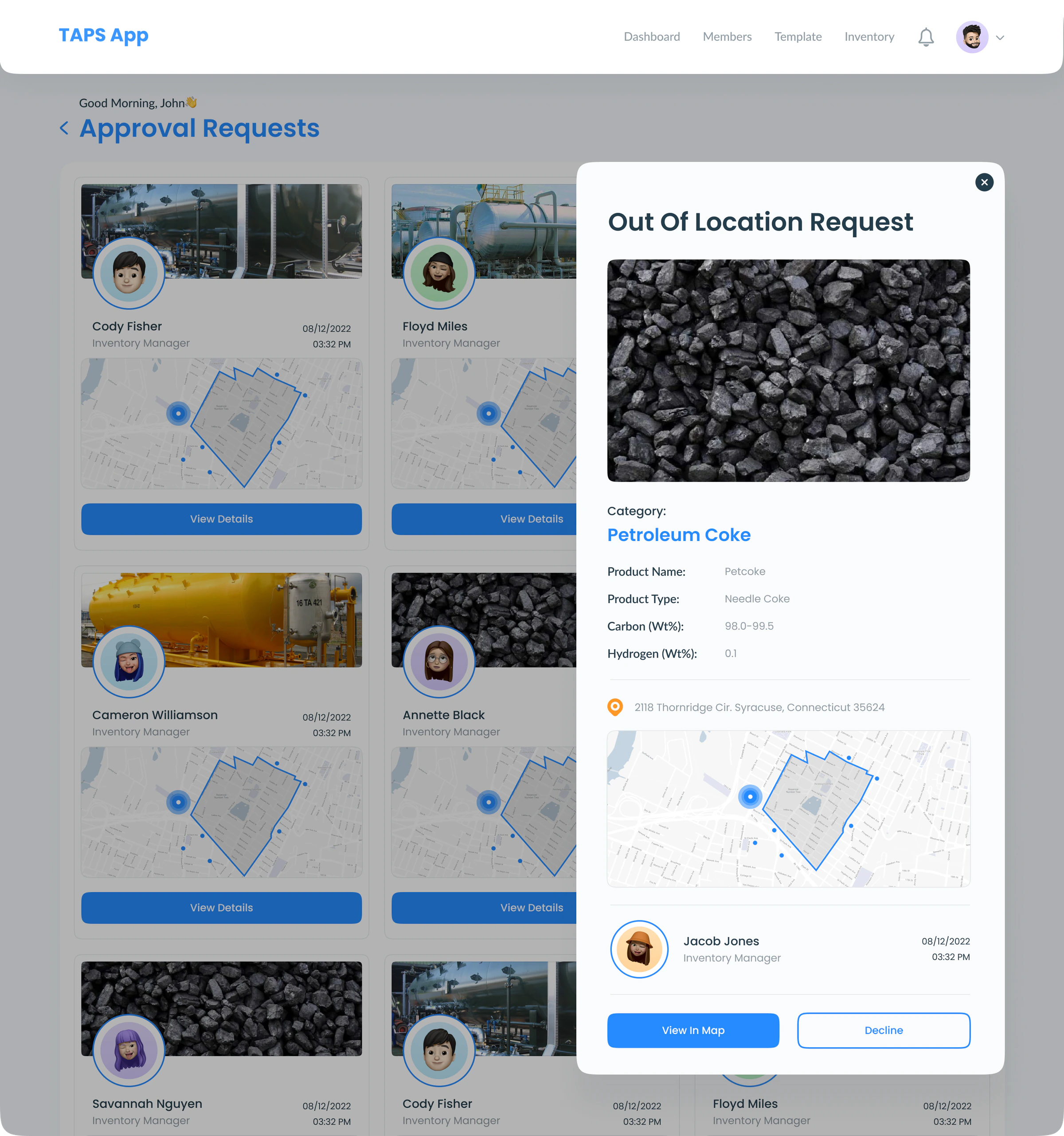
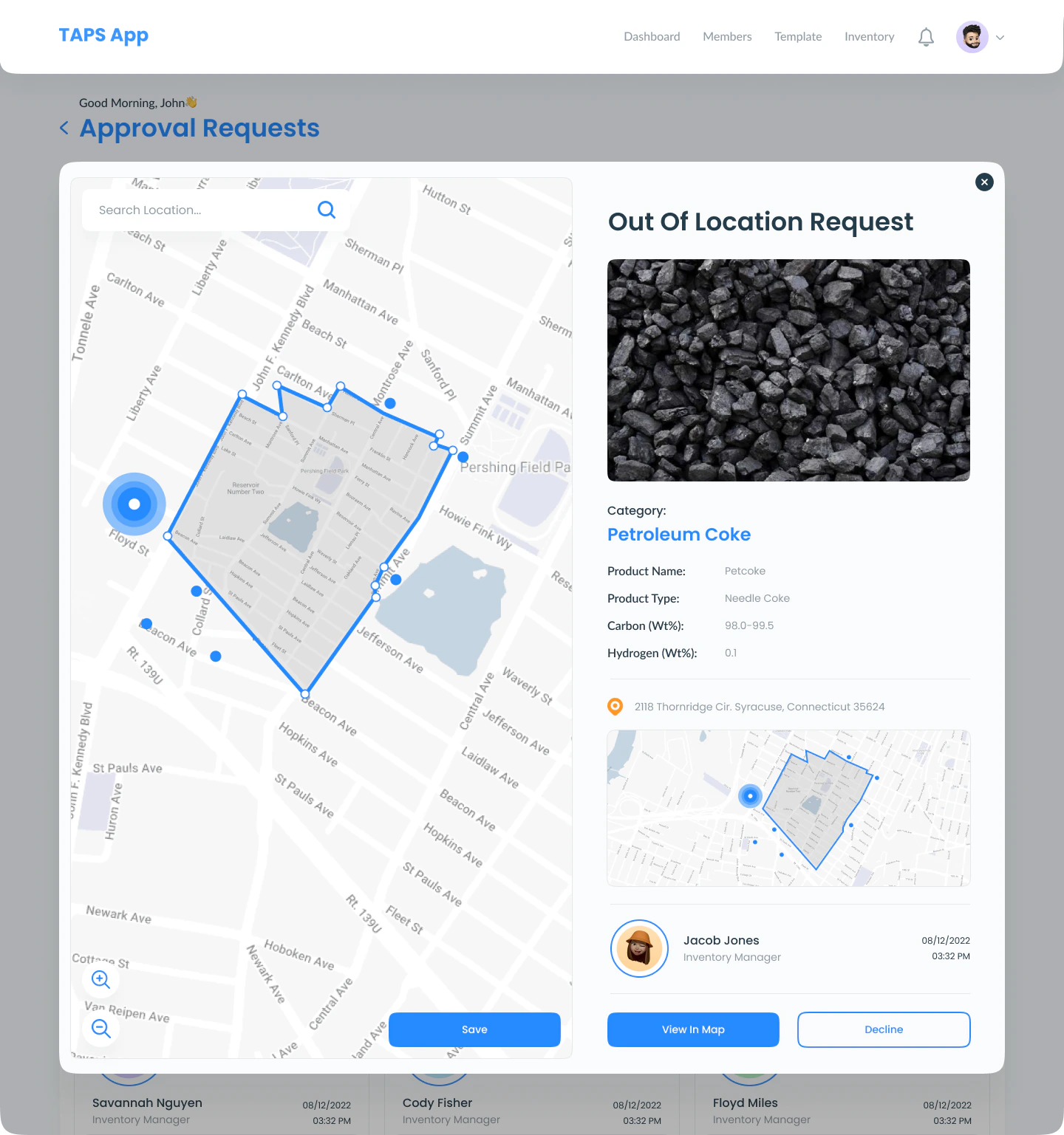
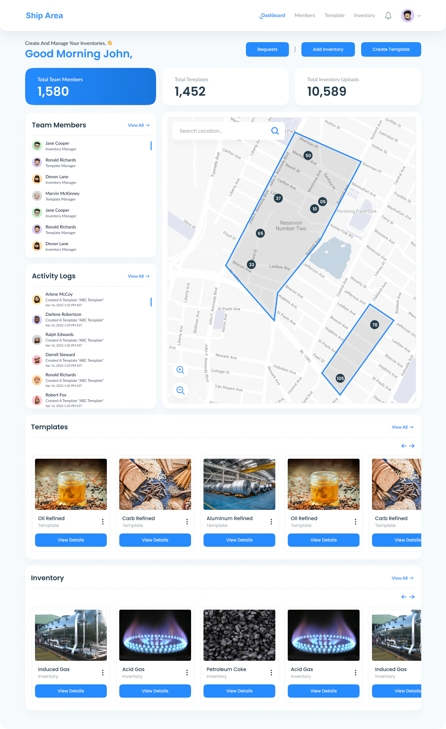
Out-of-location requests link the person, product, time, and place. The journey moves from the queue to the record, then reveals the map when a spatial comparison is needed.
Scan the requester, product, location, and time before opening a request.
Bring product details and decision controls into a focused review panel.
Compare the allowed area with the reported position before making the decision.
07 / The interface system
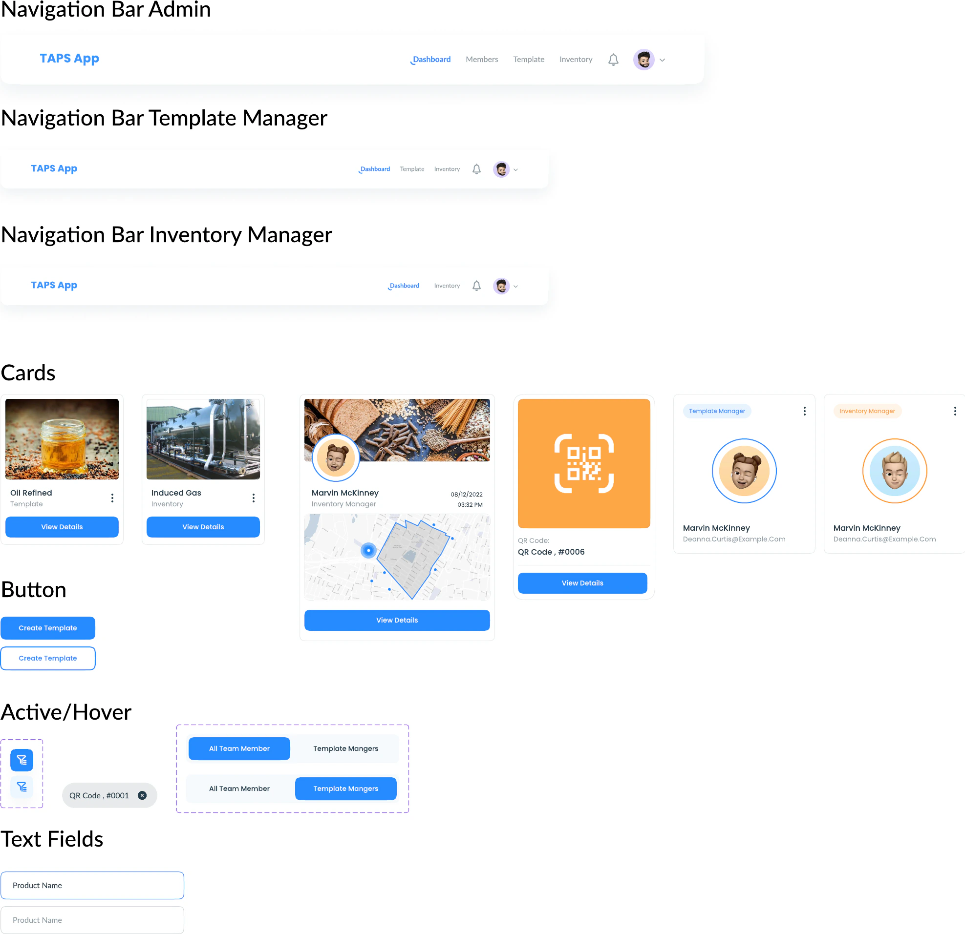
Role-specific navigation, repeatable cards, clear blue actions, and consistent fields carry the experience across the product. Wireframes established the core journeys; the next pass added operational states, with prototype links communicating the intended transitions.
About this study
Presented from the original UI exports, wireframes, and prototype. Design analysis is based on the visible work; research results and business impact have not been measured here.
Explore the original Figma design ↗What comes next
Validate how easily each role finds a record, understands location, and recovers from a failed scan or denied access. Test keyboard use, contrast, and action targets with users.
YOUR NEXT PRODUCT
Have a product with connected workflows, dense information, or multiple user roles? Let’s make it easier to use.
Let’s work together